The website of a building materials manufacturer should be more than just a digital facade. It’s a valuable marketing tool, especially when each part of the site serves its purpose in moving potential customers along the journey.
Some of the most important parts of your site are your “Where-to-Buy” pages, also known as dealer locator pages. They give customers crucial information on where to get your products, and as we’ll see in a bit, they can do much more.
We asked Matt Lee of Lead Generation Experts and Zach Williams of Venveo to combine their knowledge and building materials marketing experience to spell out 5 critical elements of Where-to-Buy pages. These features will speak to local customer needs, forge connections to the right dealers, and light the engine of your online sales process.
First, however, let’s explore what makes these pages so meaningful for your company’s bottom line.
Why Your “Where-to-Buy” Page is So Important
Let’s say a roofing contractor wants to buy shingles from your brand. They enter a search term in Google and find your Where-to-Buy webpage. After landing there, they enter their zip code and find the authorized dealer closest to them. That customer then contacts the dealer, specifies their needs, and places the order.
Fast, smooth, and convenient. That’s how it should go for a contractor, homeowner, architect, or any other kind of buyer who visits your site. Your Where-to-Buy page is the digital “bridge” between eager customers and the closest dealer that can serve them.
A great Where-to-Buy page also customizes the buying process. A survey by Epsilon showed that 80% of consumers prefer buying from companies that personalize web experiences. You’ll achieve this as soon as you show local dealers, inventory, and other helpful info to consumers on a page that feels designed just for them.
There’s one more aspect to it all. With the right software powering them, Where-to-Buy pages are a great opportunity to assess dealer performance, from first touch to the point of sale and beyond. That data can inform a better sales process, while helping you prove ROI to dealers and strengthen existing retail relationships.
5 Key Elements of the Perfect Where-to-Buy Page
1. A Comfortable User Experience
A winning Where-to-Buy page starts with the user experience (UX).
As soon as it loads, the page should provide a clear roadmap for buying your products. An eye-tracking study by Missouri University of Science and Technology showed that people spent under 3 seconds scanning a website before focusing on a certain section, and only about 5.6 seconds looking at the written copy.
That means your page should be well-designed, with no confusing or distracting elements. It should make the process of buying your products perfectly clear. The fewer steps, the better.
For example, let’s look at Honeywell’s main Where-to-Buy page.
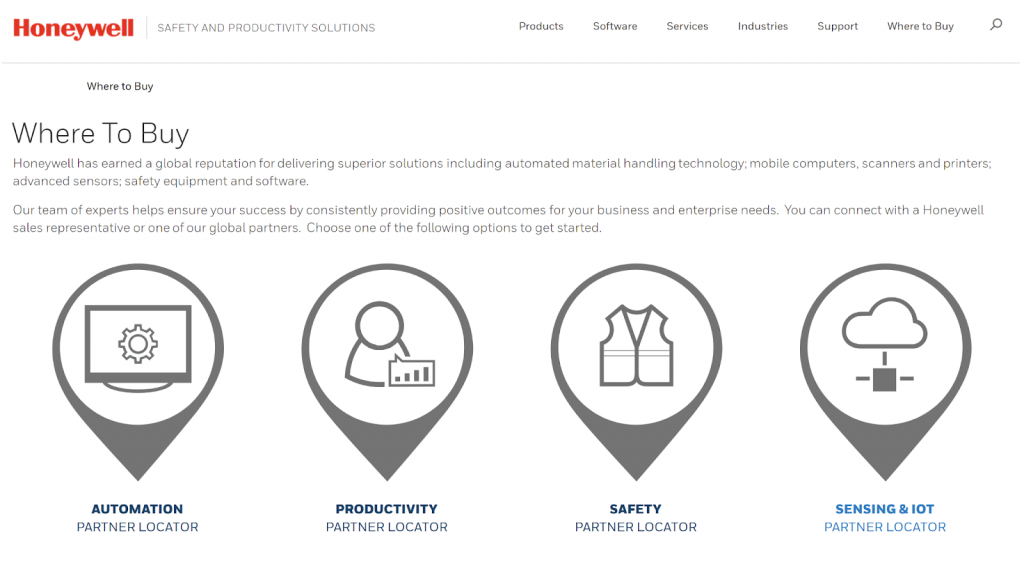
When a customer lands here, they’re presented with a clean image breaking down each category of Honeywell’s product offerings.
Let’s say the customer wants productivity solutions. If we click on the relevant pin, we’re taken to a “sub” Where-to-Buy page, the Productivity Partner Locator.
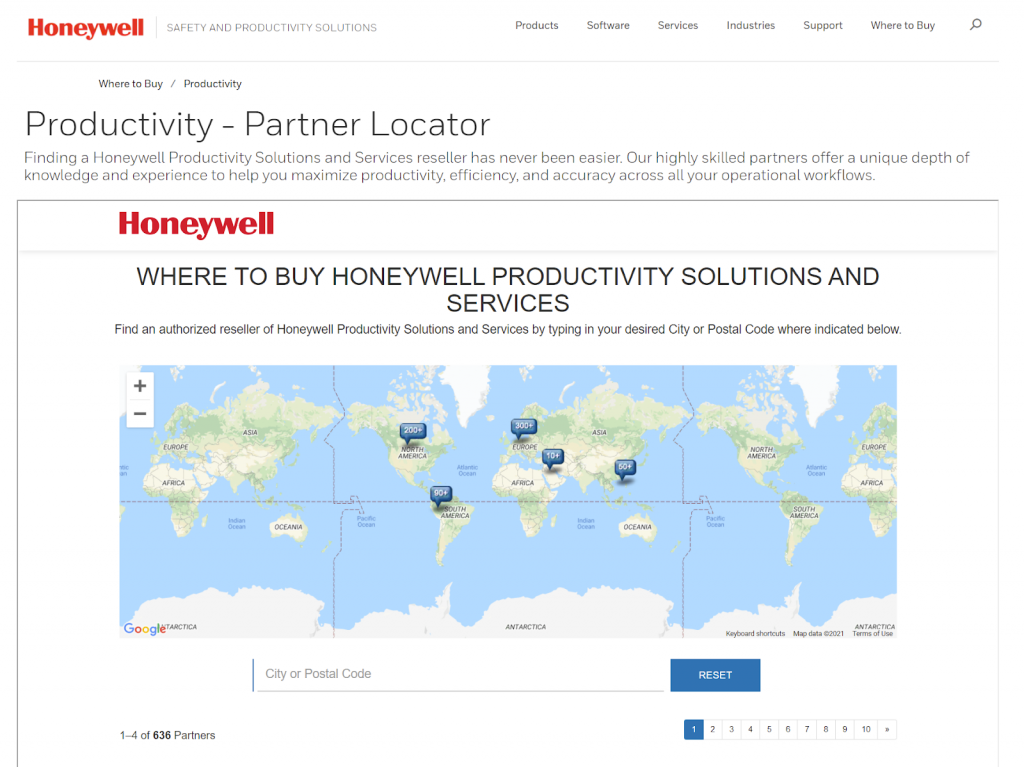
This new page features a world map and an entry field for a city or zip code. After entering a location, you then see a list of local retailers for Honeywell’s productivity goods and services. It’s simple and effective in creating a smooth glide path towards the sale.
Another good example of a Where-to-Buy page that works is provided by Allura. They call it their “Dealer Map,” and it’s every bit as intuitive as the name suggests.
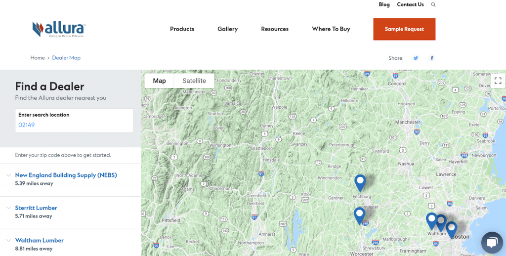
After entering a location, the user is shown an interactive map and a list of dealers in the left pane. Clicking on those dealers reveals contact info, along with links to phone numbers (especially useful for mobile website users in a hurry) and driving directions. It’s an appealing design that connects users to dealers without delay.
Just like these examples, Where-to-Buy pages for building materials should provide a comfortable, natural, information-rich user experience that takes buyers from Point A to Point B effortlessly.
2. A Speedy Process for Finding Local Dealers
Another key feature of a top-performing Where-to-Buy page? Speed. Customers should find the dealer to contact within seconds.
As it turns out, there are two simple, but often-overlooked technologies that make this possible:
Incorporate an Internal Site Search Feature
Forrester Research notes that 43% of web users who intend to buy online attempt to use an internal website search box. That’s some good incentive to implement such a feature on your company’s site.
Internal site search can help customers find products and purchase info faster, without making them manually navigate a site map. In many cases, you can link customers directly to a customized Where-to-Buy page.
This is a huge improvement over just listing a ton of building materials dealers on one page, without any user-friendly function for finding the right one. The idea here: making life easier for a customer who’s ready to buy.
Use Geolocation Detection
What’s even easier than asking a customer to enter their location? Automatically detecting it.
As long as your users have it enabled on their devices and browsers, geolocation detection is a great way to provide instant answers on local retailer info. When customers land on your site, you can instantly take them to a Where-to-Buy page made for their location. All without the customer having to lift a finger.
3. Inventory Transparency
Motivated buyers want to know that when they need one of your products, it’s actually available. A study by Kibo found that 72% of consumers look for inventory information, and roughly the same percentage may skip certain retail stores if they can’t find product availability info online.
To help out your buyers, add some inventory transparency to your Where-to-Buy pages. It helps to show whether a dealer carries specific product lines, or has certain items in stock.
By doing this, you’ll ensure greater customer satisfaction, and even avoid the human resources strain that comes with redirecting buyers to the right place. Frustration is averted, and repeat business becomes more likely.
4. A Way to Capture Leads and Measure Performance
The problem with many Where-to-Buy pages “in the wild” is that they provide dealer phone numbers and addresses, and stop there. That means there is no attribution to your or your company. When leads reach out to your dealers, your dealers could end up selling a competitor’s product instead. According to HubSpot, more than half of all marketers consider lead generation to be their #1 challenge, and building materials manufacturers have a unique opportunity in this regard.
Consider the following pop-up form on Honeywell’s website. It appears after customers select a dealer and click the “Have Partner Contact Me” button.
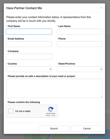
This extension of the typical “Where-to-Buy” page collects much more info from leads, which both you and your dealers can use to serve customers better.
If you want this kind of functionality — and you can envision your company using this detailed lead capture process to strengthen dealer relationships — the Bullseye dealer locator software is your friend.
Bullseye lets you create forms that intelligently harness lead data and transfer it to selected dealers via advanced closed-loop reporting capabilities. Some key features are:
- An intuitive form builder that lets you create custom fields and capture specific lead information, giving you a 360-degree customer view
- An agile API allowing you to port data to HubSpot, Salesforce, and other leading CRM tools for lead nurture and follow up
- A lead management portal that empowers you to track the customer journey without leaving the Bullseye system, if you so choose
You can set up Bullseye to send dealers lead info according to distance, past performance, or other rules. All these features add up to convenience for customers, and richer business intelligence for building materials manufacturers.
There’s a third big benefit as well: clout among dealers as a high-value partner who truly gets marketing and sales attribution. By providing key customer data and tracking performance, you’ll attract new retail partners and maintain goodwill with existing ones.
5. A Design That Leverages Local SEO
Finally, a Where-to-Buy page needs to take advantage of SEO.
It’s simply smart online marketing to ensure your website is easily found by organic searchers. A full 53% of web traffic, according to BrightEdge, is due to organic search and on top of that, 46% of Google searches are due to someone looking for local information.
Good local SEO should especially be implemented on the hardest-working pages of your site — the Where-to-Buy pages that introduce customers to dealers.
Local SEO lets you speak directly to high-intent searchers in a specific city or town. For example, if a kitchen contractor in Boulder, CO wants to purchase your brand’s granite countertops, they’ll hop from a Google search right onto your custom Where-to-Buy page, which lists local kitchen remodeling dealers.
Bullseye seamlessly creates properly optimized Where-to-Buy landing pages for you. In addition, the platform offers:
- The ability to feature multiple photos per dealer, so your leads instantly recognize the store when paying a visit
- Implementation of all good local SEO standards, including an interactive local map, dynamically-generated page titles and meta description tags, and keyword-rich page URLs
- A place for links to each dealer’s social media profiles — which is great both for your page’s SEO clout, and for the convenience it offers local searchers

Great Where-to-Buy Pages: More Leads and Sales for Building Materials Manufacturers
Too many building materials buyers are getting frustrated online. Manufacturers are failing to offer a customized, convenient user experience on their Where-to-Buy pages. In addition, leads are slipping through the cracks, because those pages aren’t optimized for lead generation.
This doesn’t have to be the case! Don’t let your Where-to-Buy page be your biggest missed lead gen opportunity.
You can add real value to your customers and dealers, while gaining more customer insights, by following our tips for a great Where-to-Buy page. See how it looks in action with 4 examples of building product manufacturers that are using dealer locators effectively.
How to achieve this without technical prowess and spending tons of time? The Bullseye locator software can get you there with ease. The platform has all the tech under the hood to generate optimized, user-friendly, targeted Where-to-Buy pages that actually increase leads and sales.
Schedule a free demo today to see what Bullseye can do for you.


