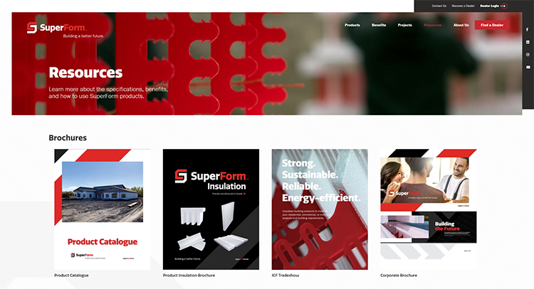
What does a building materials manufacturer need on its website to convince discerning visitors to buy? A stellar product page.
Product pages are where you describe your product’s features and benefits, explain their unique advantages, and point the way towards making a purchase. They offer a key opportunity to persuade prospects to choose your brand over others.
Many companies’ product pages fail to make an impact, however. The pages are often missing elements that attract web users to the site in the first place, or that make it easy to buy.
Your brand can get it right. Here are our tips for creating the perfect product page. If you implement them, you’ll see more web visitors respond the way you want…and you’ll have better online sales numbers to show for it.
1. Convert Visitors with “Above the Fold” Optimization
Think about what section of your product page will make the most immediate impact. If you’re guessing it’s what the user sees first, you’re right.
The terminology “above the fold” comes from the long-ago days of newspaper publishing, when newspapers had to be folded for display in newsstands. Everything above the first “fold” was meant to capture people’s attention.
Your product page must do the same the moment it loads, before the user even scrolls down, in order to be effective.
Your main focus above the fold should be to convert leads to customers. Make sure you have a strong headline indicating your product offering so that users know they’re in the right place. It’s helpful to have a 1-2 sentence subheader speaking to your main value propositions.
Another helpful touch is to have bullet points explaining features and benefits, along with a powerful product image. Finally, you should ensure there’s a call-to-action (CTA) button that invites users to the next step by clicking through.
A great example of this is provided by TruLog, makers of steel log siding. The section of their product page that’s “above the fold” employs most of the elements described above to great effect.
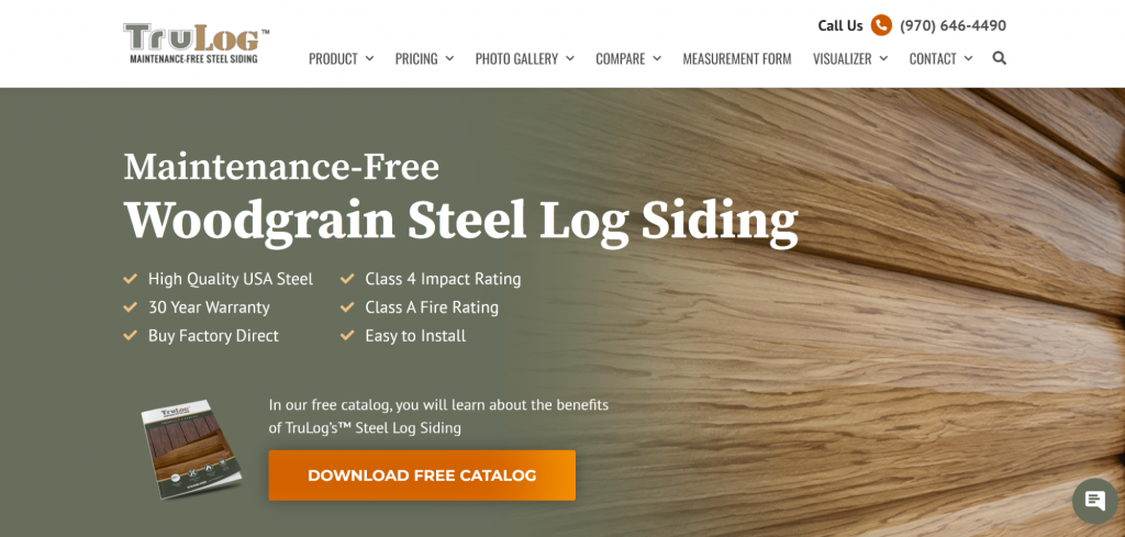
By clearly stating what the product is, listing key benefits with checkmarks, and inviting users to download helpful content with a clear call-to-action, TruLog’s product page is set up from the very first glance to start converting seekers into buyers.
2. Optimize “Below the Fold” Content for Search Traffic
After your web visitors have seen everything at the top, you’ll want them to take the next step towards actually buying. That means giving them even more helpful information, with engaging details and answers to the questions arising in their minds, “below the fold.”
This should be done, however, with a nod to search engine optimization (SEO). Using keywords that people type into Google and other search engines in your below-the-fold content is the perfect opportunity to improve your search rankings and bring in more traffic organically.
BRAVA, the maker of high-performance roofing, demonstrates this on their product page. There’s lots of good descriptive content that is both keyword-rich and goes into further detail about their products, in the event a customer wants to learn more.
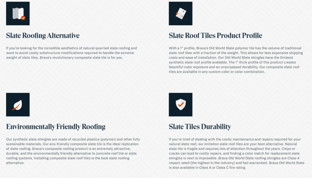
If you add content like this below the fold and infuse it with relevant keywords, both search engines and human web visitors will take note.
3. Use High-Quality Product Images
The saying that “a picture is worth 1,000 words” has never been truer than in today’s digital age.
On your product page, high-quality images of your merchandise are an absolute must. According to Etsy and Justuno, 90% of online buyers indicate that the quality of product photos is very important in convincing them to buy online.
That means, to make an impact, a building materials manufacturer should have sharp, well-lit, and attractively-staged photos of products in contexts that make sense for customers.
BRAVA, for example, has great photos of their roofing tiles throughout the product page to give customers a real idea of what they’ll get once they order. There are also photos of installed roofs, so customers can see the tiles in the context of a finished project.
Using pictures as a strong visual aid will give your web visitors a reason to start imagining your products meeting their real-life needs.
4. Embed Product Demo Videos
What is even better than static images of your products and services? A video.
Videos are constantly proving to be the most engaging type of content marketers can use online, and the trend will not slow down anytime soon. A survey by Animoto found that almost 73% of consumers are more likely to buy a product or service if they first see an explanatory video.
To make videos work for your product page, be sure to show your product in action. You might show various angles of installations that use your brand’s materials, diagrams that break down your product’s unique features, or even a before-and-after scenario with a satisfied customer.
You can even get creative and test animated explainer videos, or if applicable, use drone technology for a fly-over of a house or commercial property using your brand’s exterior building products.
Put simply, a moving picture will move people to act.
5. Use Calls-to-Action for Each Sales Funnel Stage
Your product page visitors won’t act unless you tell them to. It’s worth saying those extra few words to get them to actually do what you desire them to do: take the next step towards a purchase.
This is where carefully worded calls-to-action come in. If your headline gets read, there’s a high chance your CTA copy will get read. As Unbounce found, as much as a 90% lift in click-through rates can happen just by using the right words.
For that reason, you’ll want to make your CTAs relevant for each stage of your sales funnel, in order to meet prospects where they’re at and increase the chance of conversions. Here are some examples:
- For the top of the funnel, web visitors just finding out your brand will need to get more familiar with who your company is and what you offer. In this case, you might use a CTA button that says “Sign Up For Our Newsletter.”
- For the middle of the funnel, your prospects now know about your brand, and might be comparing your products with those of your competitors. You can use a CTA button that reads “Download Our Product Comparison Sheet” or “Download Our Buyer’s Guide” for a chance to show why your brand is the right choice.
- For the bottom of the funnel, prospects know your brand, know what they need, and are ready to take action. Nudge them along with a CTA like “Request a Quote,” “Order Now,” or “Where to Buy.”
Sprinkle CTAs that speak to each sales funnel stage throughout your product page, and you’ll effectively speak to a wider range of your prospects, no matter where they happen to be in the customer journey.
6. Have a Frequently Asked Questions (FAQ) Section
One thing is for sure: your prospective customers will have questions!
A study by American Express found that more than 60% of consumers say that they prefer to use self-serve tools, such as a website’s Frequently Asked Questions (FAQ) section, to answer simple questions they may have. Your product pages will be much more effective if you anticipate those questions and provide helpful answers in a FAQ.
DecksDirect is one building materials manufacturer that does a great job with this. Towards the bottom of the product page, there’s a FAQ section with toggles that web users can open, depending on what questions they have.
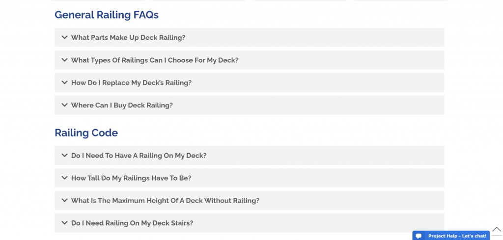
As a bonus, DeckDirect’s FAQ section has keyword-rich answers to customer questions, which will likely help the page’s SEO status and bring in more traffic from Google.
Use the FAQ to enter the conversation in your prospects’ minds, and you’re that much closer to turning them into paying customers.
7. Use Social Proof to Build Brand Authority
One of the most important aspects of getting customers to see your brand as authoritative is to earn and display social proof.
Especially on your product pages, social proof elements like key industry awards you’ve won, names of big clients you’ve served, or high marks you’ve earned from consumer review authorities can go a long way towards building trust and convincing your leads to buy.
TruLog has a few social proof elements shown in a horizontal row on their product page:

These images help to show that TruLog is an established, respected business that customers can trust.
Implementing something similar on your product pages will likely meet a customer’s unspoken, often unconscious need to know that they can trust your brand before reaching for their credit card or looking up a dealer (more on that in a bit).
8. Add Testimonials to Create Even More Trust
You can build on the “trust” factor of your product pages in a substantial way by adding a section of customer reviews.
According to BigCommerce, a whopping 92% of customers read online reviews before they buy, and 72% of consumers say positive reviews and testimonials help to build their trust in a business. Including reviews from others who have bought from you, and are willing to talk about why they’re happy, can make a huge difference in sales originating from your website.
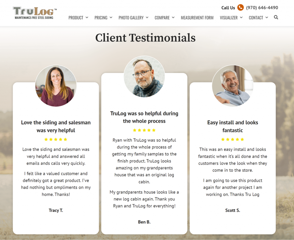
The testimonial section on TruLog’s product page is a great example of this. The three featured customer reviews are informative, eye-catching, and speak to different reasons why someone should trust TruLog’s products and process.
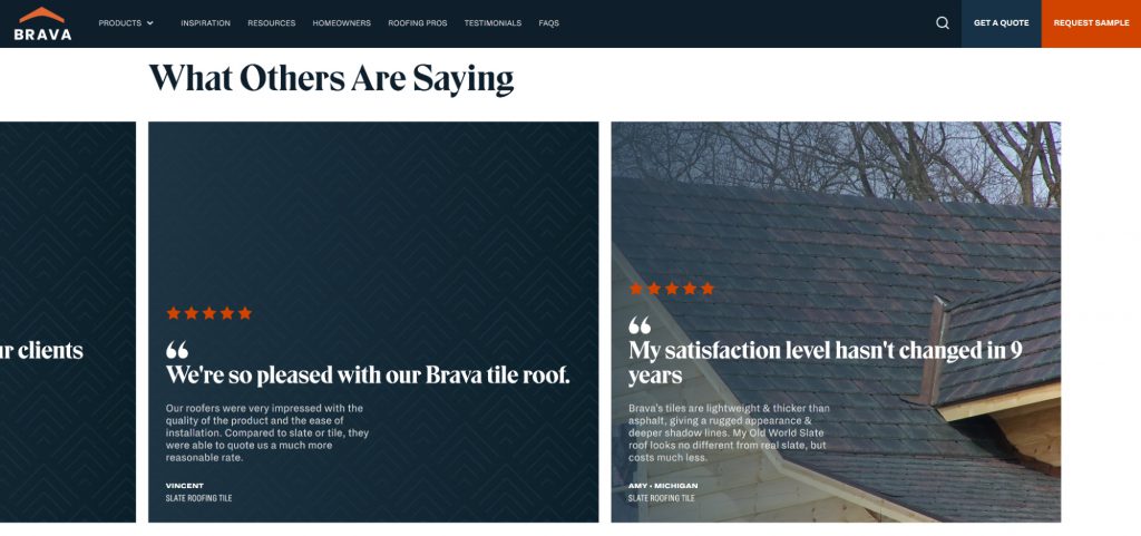
BRAVA also earns high marks for their testimonial section, which is in a “slider” format that web visitors can scroll through to get different customer perspectives.
By using an approach similar to one of the above, you’ll show customers others just like themselves who made the choice to go with your brand. Add testimonials and your improved product page ROI will speak for itself!
9. Include Support Documents for All Audiences
As a building material manufacturer, you must not only market to end consumers, but to the professional customers who actually resell or employ your products in their work, such as local dealers, architects, and installers.
How do you reach them effectively? By providing helpful support documents made just for them. In A Fluent Vision’s 2018 State of Partner Marketing Report, 75% of professional respondents ranked online content as important, but 53% ranked content shared by the manufacturers and vendors they partner with as mediocre or worse.
That means your brand has an important opportunity to step up and provide high-quality support content to local channel partners, as well as end consumers such as homeowners. Make documents such as product specification PDFs, proofs of certification, installation guides, and style guides available and easy to access on your product page.
However, when there’s a lot of material to distribute — and you want to make sure the right support documents get to the right audience, while tracking downloads and keeping all materials organized — the task can quickly get overwhelming.
An enterprise building materials company with many locations might have many different materials to be distributed. It’s easy for hundreds of such documents to become disorganized, hard to categorize, and difficult to get to the right people both inside and outside of your organization.
The answer? A digital asset management solution like RevBase, a software solution that is now part of Bullseye Locations. RevBase allows you to efficiently manage hundreds or thousands of content pieces and support documents, enabling you keep all assets organized and up-to-date, while tracking which ones are downloaded and used.
Integrating a software solution like RevBase is one of the best ways to get the right support documents to the right audience, at the right time.
10. Include a Product Locator
If web visitors landing on your product page are ready to buy, you’ll need to help them do so. This often means pointing them directly to the closest local dealer. The best way to achieve this: a product locator.
Bullseye Locations is the premier solution for building materials manufacturer product pages. Bullseye’s optimized, easy-to-use locators will make it easy for your web visitors to find the dealer they’re closest to — making it a cinch for them to get to the point of sale as soon as possible.
As shown in the following examples from ABC Materials, Bullseye can integrate with your product pages in a way that provides different tabs for local and online retailers. You can also change the positioning of the map to be on top or on the side of the listed retailer results.
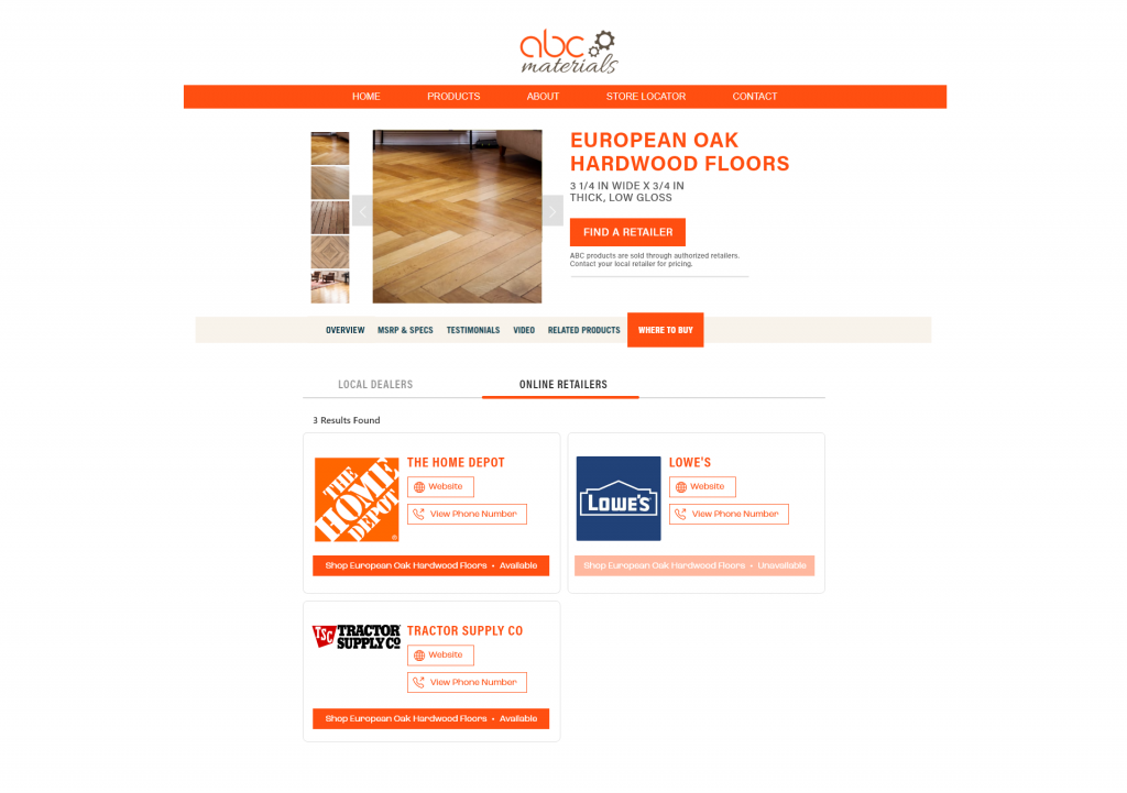
Adding a powerful Bullseye-built locator like this to your product pages, with a tabbed feature that makes navigation easy for your web visitors, will provide a natural bridge to the sale. You’ll raise your website’s value as a sales tool in the process.
For a Best-In-Class Product Page, a Building Materials Manufacturer Should Use Every Strategic Advantage
Your competitors likely have product pages in some shape or form on their websites. Many of them won’t have the very simple enhancements mentioned above.
This is a perfect opportunity for you to step in and win.
By bringing conversion elements, trust signals, powerful calls-to-action, and high-quality visuals to your product pages, you’ll make it much easier for your customers to buy.
Take it up a notch by using a solution like RevBase to organize and distribute a wide array of support documents to all the customer audiences who visit your website — both pros and individual consumers. In addition, use Bullseye to build a dynamic locator that instantly takes your prospects to the next step for a purchase.
By taking your product page to the next level with these enhancements, you’ll help your website meet its potential as your brand’s digital storefront.
Want to learn even more about how Bullseye and RevBase can help make your product page a success? Schedule a demo today to see what’s possible.


